


Each field on a PDF form has a collection of properties that control how it appears and functions. When creating, updating, or developing a PDF form, accessing and modifying these properties is likely the most common task. If you want to know more about how to set PDF form properties with LightPDF, please read the following tutorial.
Locked
When selected, any future modifications to the properties of any form field are disabled.

General
- Name: You can set the field name.
- Prompt: You can add something in this field to remind people what to fill in. When filling in the form, the prompt content will appear once you move the mouse over the item.

Common Properties:
- Form Field: Specifies whether the form field can be seen, either on screen or in print. “Visible”, “Hidden”, “Visible but doesn’t print”, and “Hidden but printable” are the options.
- Read Only: People are able to access the form field content but can’t modify it.
- Required: Makes people fill in the form’s chosen field. If the user attempts to submit the form while a required field is blank, an error message appears and the empty required form field is highlighted.

Appearance
Borders and Colors
- Border Color: Opens a color picker so you may choose a color for the field’s surrounding frame. Choose “No Color” to exit the field without a frame.
- Fill Color: Opens a color picker so you may choose a color for the background behind the field. Select “No Color” to leave the field uncolored. (Note: If you select “Fill Color” other than “No Color”, any images on the PDF page that are below the form field will be obscured.)
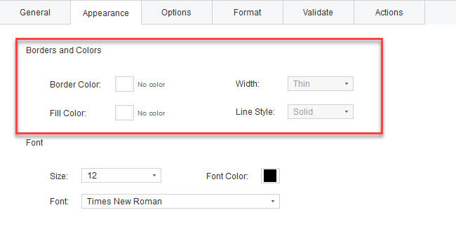
- Line Style: Alters the frame’s appearance. A solid, dashed, beveled, inset, or underline option is available.

Font
- Size: Determines the size of user-entered text or the check box or radio button selection marker.
- Font: Provides a list of the fonts on your computer. For form fields that don’t show text, this option isn’t available.
- Font Color: Opens a color picker in which you can select a color swatch for the text or selection marker.

Options
Text Field
- Align: Aligns the text left, right, or center within the field.
- Default: Specifies the text that appears up until the user types something in the field to replace it. By inputting this option, you will enter the default value.

Check Box
- Check Box Style: Defines the appearance of the marker inside the check box when it is selected: “Checkmark”, “Circle”, “Cross”, “Diamond”, “Square”, or “Star” are all available options. The check box’s shape is unaffected by this feature.Note: The font size you choose in the “Appearance” tab will affect the size of the marker inside the check box.
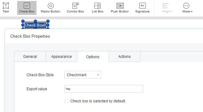
- Export Value: Specifies a value to represent the item if the data will be exported. If the export value is left empty, the item for Name in the “General” tab is used as the export value.
- Check box is selected by default: Shows the check box selected unless the user deselects it.

Radio Button
- Button Style: Specifies the shape of the marker that appears inside the button when the user selects it: “Checkmark”, “Circle (the default)”, “Cross”, “Diamond”, “Square”, or “Star”. The radio button’s physical shape is unaffected by this feature.
- Button is checked by default: Sets the selection state of the button when the user first opens the form.
- Select the button with the same name and button option: Allows you to pick numerous related radio buttons with a single click. For instance, both radio buttons are selected if the user chooses one that has the same field name and selected content as another.

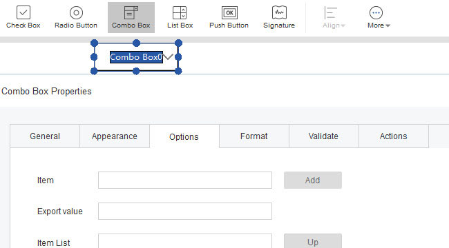
Combo Box & List Box
- Item: Accepts the text that you type for options that you want to appear in the menu for the field.
- Export value: Where to enter a value if the data will be exported for that item. If the export value is left empty, the item for name in the “General” tab is used as the export value.
- Item List: Shows the options that will be present in the list.
- Sort Item: Sort the items on the list by number and alphabetically.
- Multi Selection: (List boxes only) Enables users to choose more than one item in the list.
- Allow user to enter custom text: (Combo Box only) Enables users to enter a value other than the ones in the list.
- Submit selected values: Saves the value as soon as the user selects it. If this option is not chosen, the value will only be saved when the user clicks another form field or tabs out of the current field. If “Multiple Selection” is used, this option is disabled for List boxes alone.


Push Button
- Layout: Select the appropriate option from the “Layout” if you wish to utilize an icon look or have text show within the button.
- Behavior: “None”, “Inset”, “Outline”, and “Invert” can be chosen there.
- Status: You may choose the trigger using the Status. The “Mouse Up” behavior is set as the default. You should typically keep the trigger action at its default setting.

Format
Selected format category
Validate
Field value is not validated
Field value is in range
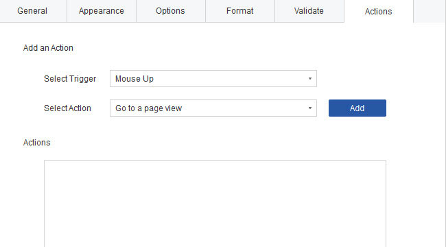
Actions
Add an Action
- Selected Trigger: Specifies the user action that initiates an action: “Mouse Up”, “Mouse Down”, “Mouse Enter”, “Mouse Exit”, “In Focus”, or “Blurred”.
- Selected Action: Specifies the event that occurs when the user triggers the action: “Go to a page view”, “Open a file”, “Open a web link”, “Show/Hide a field”, “Submit a form”, “Reset”, “Import form data“.
Actions
- Up and down buttons: The chosen action’s listing under the trigger may be rearranged in any order. (Only available if the same trigger has numerous defined actions.)
- Edit: Opens a dialog box with specific options for the selected action.
- Delete: Removes the selected action or trigger-action pair.

If you encounter any problems in the process of using the LightPDF, please feel free to contact us.
Leave a Comment